For Task 1, I am guided to describe and analyse key design principles, selecting appropriate visual examples to demonstrate my understanding. I am required to choose original design examples that effectively represent each principle, ensuring that I do not reuse images from lecture notes or videos.
Design Elements
1. Line
Rather A line in design serves the foundational purpose of moving the eye of the viewer towards a focal point. It can be straight, curved, thick, thin, or broken, influencing the rigidity or fluidity of a design.
2. Shape
Shapes are enclosures formed by lines or colours, and can be geometric like triangles and circles, or organic such as freeform or natural shapes. Shapes help create structure and meaning in a design.
3. Colour and Value
Different colours bring with them various emotions such as blue, which is known to represent calmness, while energy is represented through red. Value is lightness or darkness of color that creates contrast and depth. Value determines the forms and adds to the realism.
4. Texture
Texture in design can either be visual or tactile, but in general, it is the surface quality embellishments of the design. It adds depth and dimension.
5. Space
 |
space around items allows them to be 'read' more easily
|
Space refers to the surrounding and bounded space of things. Positive space contains the subject, and negative space is the surrounding space devoid of content. Proper use of space creates balance and simplicity.
6. Form
 |
Design Element - Shape (3d)
|
Form is a three-dimensional shape that has depth, height, and width. Unlike flat shapes, forms appear more realistic.
7. Point
 |
Design Element - Point
|
A point is a basic design unit, one space position. It can be minute or large and is typically utilized to draw the eye.
Design Principles
1. Gestalt Theory
Gestalt theory is a psychological concept that explains how people perceive visual elements as unified wholes rather than just individual parts. It includes principles like proximity, similarity, closure, continuity, and figure-ground, which help designers create visually harmonious compositions.
★ Principle of Similarity
The Principle of Similarity in Gestalt theory states that objects that look similar are perceived as related or grouped together.
Key Features:
- Similarity in Shape, Colour, Size, or Style – Elements that share common visual traits are naturally associated.
- Helps in Organization – Users can quickly recognize patterns and find related items.
- Improves Usability – Reduces cognitive load by making navigation intuitive.
Example:
Google Drive
Google Drive applies the principle of Similarity by using:
- Consistent File Icons & Colors – Docs (blue), Sheets (green), Slides (yellow), making file types easily recognizable.
- Uniform Folder Design – Standard folder shapes with optional colour-coding for quick grouping.
- Collaboration Indicators – Shared files have avatar icons, distinguishing them from private files.
- Grid & List View Consistency – Maintains a similar structure for easy navigation.
- UI Element Similarity – Buttons, icons, and toolbars share a uniform style for familiarity.
★ Principle of Continuation
The Principle of Continuation in Gestalt theory suggests that elements arranged in a line or curve are perceived as a whole, continuing in a smooth and consistent pattern.
Key Features:
- Flowing Movement – We naturally follow a visual path, even if it's not explicitly drawn out.
- Visual Harmony – People tend to perceive objects or elements as part of a continuous form, rather than disconnected pieces.
- Creates a Sense of Order – Continuation guides the viewer’s eyes along a sequence, making designs easier to follow.
Example:
Apple's macOS Dock
The row of icons in the Dock creates a horizontal flow from left to right, guiding the user’s eye naturally along the line.The icons are arranged in a continuous strip, helping users easily identify, launch, and switch between apps with minimal effort.As you move your cursor across the Dock, it guides your attention smoothly from one app to the next, creating a seamless interaction.
★ Principle of Closure
The Principle of Closure in Gestalt theory suggests that we tend to perceive incomplete shapes or figures as complete. Our brains fill in the gaps or missing parts to create a whole, even if the information is not fully provided.
Key Features:
- Completion of Visual Information – If parts of an object or shape are missing, we mentally fill them in to complete the whole figure.
- Organizing Incompleteness – The mind seeks closure and forms a complete image, even from partial data.
- Perception of Unity – Our brain instinctively connects the dots or lines, creating a sense of unity and structure.
Example:
WWF logo
- The logo features a panda with some parts of its body intentionally left incomplete (e.g., missing sections of the limbs and face).
- Our brains fill in the gaps, automatically completing the panda image even though the entire shape isn't physically drawn out.
- This use of incomplete lines and shapes engages the viewer’s mind to "close" the figure, allowing them to perceive the panda as a whole, despite the minimalistic design.
★ Principle of Proximity
The Principle of Proximity in Gestalt theory states that objects that are close to each other are perceived as being related or grouped together, even if they are different in other ways.
Key Features:
- Visual Grouping: Items that are physically close to each other are seen as a cohesive group.
- Clarity and Organization: Proximity helps organize complex information by creating natural clusters of related elements.
- Improved Usability: It makes designs more intuitive by visually grouping related content.
Example:
The Girl Scouts Logo
★ Principle of Figure/Ground
The Principle of Figure/Ground in Gestalt theory describes the relationship between a figure (the main object of focus) and the ground (the background or surrounding space). This principle suggests that we perceive objects (figures) as separate from their background (ground), even if the distinction is subtle.
Key Features:
- Focus on the Figure: The object or shape we focus on is the figure, and everything else around it is perceived as the ground.
- Reversible Perception: Sometimes, the figure and ground can reverse roles, creating an optical illusion where the background becomes the figure and vice versa.
- Clarity & Contrast: The figure is usually more defined or contrasting than the ground, making it stand out.
Example:
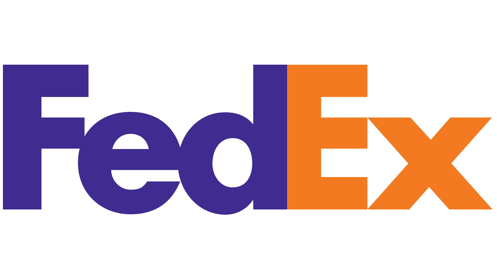
FedEx
The
FedEx logo – The arrow between the "E" and "X" is the
figure, while the rest of the logo text serves as the
ground. The arrow is not immediately obvious, but the contrast makes it stand out as a focal point.
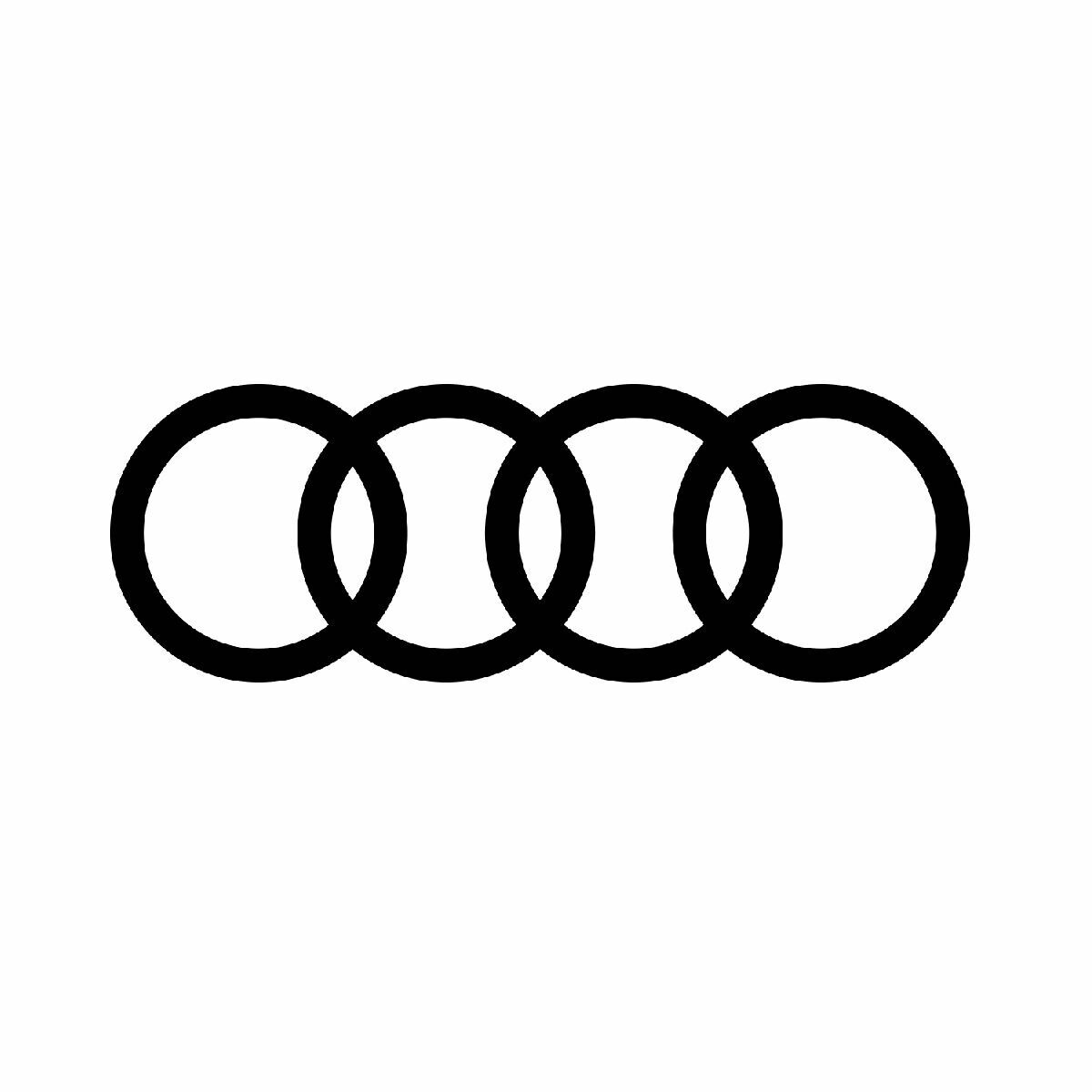
★ Law of Symmetry & Order
The Law of Symmetry & Order (also known as the Principle of Symmetry) in Gestalt theory states that objects or elements that are symmetrical are perceived as belonging together and creating a balanced, harmonious whole.
Key Features:
- Symmetry: We tend to perceive symmetrical objects as a single, unified form. The human brain naturally seeks symmetry, as it is associated with balance and harmony.
- Order: We prefer well-organized, structured, and orderly designs, as they are easier to process and understand.
- Balance and Harmony: Symmetry creates a sense of equilibrium in design, making it visually pleasing and more digestible.
Example:
Audi
The four rings represent the four founding companies of Auto Union (Audi, DKW, Horch, and Wanderer), and their interconnectedness emphasizes the unity of the brand.The symmetrical arrangement of the rings conveys strength and stability, which are qualities Audi associates with its vehicles.
2. Contrast
Contrast is the difference between elements in a design, making certain parts stand out. It can be achieved through colour, size, shape, texture, or typography.
Barack Obama "Hope" Poster (2008, by Shepard Fairey)
The poster uses red, blue, and beige in strong contrast to create a bold, eye-catching effect. It became an iconic piece of political design, symbolizing optimism and leadership.
3. Emphasis
Emphasis directs the viewer’s attention to a focal point in the design by using size, colour, placement, or contrast.
McDonald’s “McDelivery” Billboard (2020)
 |
| Link source: https://images.app.goo.gl/Zj9jrPvmx2ggSeYc8. |
Golden Arches as a Visual Cue: The McDonald's arch is cleverly used as part of the composition, forming the illusion of a large delivery path leading to a single-lit window in an apartment building.
This subtly directs the viewer's focus to the idea that McDonald's delivers late at night.
Contrast & Colour: The bright yellow of the McDonald’s arch and the single-lit window contrast against the dark greenish-blue background, making the message stand out. The darker tones of the buildings push the eye toward the lit window, reinforcing the message.
Minimalism for Focus: By keeping the elements simple and uncluttered, the focus stays on the message—McDonald’s delivery reaches your home, even late at night.
4. Balance
Balance in design refers to the distribution of visual weight within a design to create a sense of stability and harmony. It ensures that no part of the design feels too heavy or out of place, resulting in a visually pleasing composition.
★ Symmetrical Balance (Formal Balance)
- Definition: Visual elements are arranged evenly around a central axis, creating a mirror image on both sides.
- Effect: Creates a sense of formality, stability, and order.
Example:
Swan, Rush and Iris, Walter Crane (1845-1915)
In the illustration, the composition features symmetrical elements around a central axis, with mirrored or near-mirrored shapes on both sides.The placement of the swan in the center, flanked by the rush and iris on either side, creates a balanced, formal feel that aligns with the principle of symmetrical balance.The mirrored symmetry of the design emphasizes harmony and order, which is characteristic of this balance type.
★ Asymmetrical Balance (Formal Balance)
- Definition: Elements are arranged unevenly, but the visual weight is distributed in a way that creates balance through contrast, color, and scale.
- Effect: Creates a more dynamic and interesting composition, offering a sense of movement while still feeling balanced.
Anders Zorn: Self Portrait
Why It’s Asymmetrical:
- The composition has uneven distribution of visual weight, with Zorn placed slightly off-center.
- The background, with darker tones and lighter areas, balances the focal point without using symmetrical elements, creating a more dynamic and interesting composition.
★ The Golden Ratio
The Golden Ratio (1:1.618) is a mathematical ratio used in design to create balanced and aesthetic compositions. It's often applied to layouts, logo designs, photography, and typography. By dividing space or elements based on this ratio, designs feel harmonious and naturally pleasing to the eye. The ratio is found in nature, which is why it’s visually appealing to humans.
The Sacrament of the Last Supper
The shape of the canvas itself is a rectangle with proportions that closely follow the Golden Ratio.The table in the painting is positioned in such a way that its length and width align with the Golden Ratio, creating a sense of balance and harmony.The central figure of Christ and other elements are placed according to the Golden Ratio, guiding the viewer’s eye naturally through the painting.
★ Rule of Thirds
The Rule of Thirds divides an image into a 3x3 grid, placing key elements along the lines or intersections for balanceand visual interest.
Why It Works:
- Creates dynamic compositions by avoiding a centered look.
- Guides the viewer’s eye naturally.
- Enhances storytelling in photography, film, and design.
Example:
It Begins Dune
The main subject (such as Paul Atreides or a key visual element) is positioned along the grid's intersecting lines, creating a balanced yet dynamic composition.Horizon lines or key elements (like the sand dunes, sky, or text) align with the top or bottom thirds, guiding the viewer's eye naturally.This technique makes the poster feel cinematic and engaging rather than static.
5. Repetition
Repetition strengthens a design by consistently using colours, fonts, shapes, or patterns to create unity. It makes a design feel more structured and visually appealing.
Louis Vuitton Monogram Pattern
 |
| link source: https://images.app.goo.gl/PQWcYfAsC8uMobSp6 |
The LV monogram, quatrefoils, and flowers are repeated across bags and accessories. Establishes a luxury identity and enhances design consistency.
6. Movement
Movement guides the viewer’s eye through a design in a planned way, using lines, shapes, and composition to create a sense of flow.
Hokusai, Ejiri in Suruga Province in 1830.
In this example of movement in art, the artist shows the movement of the wind through the shapes of the paper. The lines of the figures and the lines of the billowing clothing convey movement in art as well.
7. Harmony & Unity
Harmony ensures that all elements in a design complement each other, while unity makes sure that the composition feels like a cohesive whole.
Apple Product Design (iPhone, Mac, iPad)
 |
| link source: https://images.app.goo.gl/hYemU91VoTEN4v5K8 |
Apple maintains a consistent design language across all products, using minimalism, symmetry, and uniform materials.
Effect: Creates a seamless user experience and a cohesive brand identity.
8. Symbol
Symbols are visual elements that convey meaning beyond their literal appearance. They can be icons, logos, or cultural symbols.
Recycling symbol
 |
| credit: https://images.app.goo.gl/KFewExFEtixT4s4dA |
The recycling symbol represents environmental sustainability without needing words.
9. Word and Image
This principle refers to the combination of text and visuals to enhance communication. The relationship between them should be balanced and meaningful.
Aespa "Savage"
The letters representing typography are no common types; they have been carved out in the form of metallic objects with a spear-like, even weapon-like, appearance. What happens here is that the letters become images hence further projecting the concept of savagery.
Futuristic & Cyberpunk Aesthetic – The chrome and reflectively textured logo accentuates a high-tech and digital essence, being perfectly aligned with Aespa's AI-based concept and futuristic brand.
Symbolic Meaning: The sharp, claw-like edges of the letters symbolize power, strength, and aggression which are consistent with the aggressive tone of the song. Typographic means by themselves suggest a fierce and rebellious energy.
Seamless Fusion of Word & Image – The very dynamics of the design of the logo seem to call for it to be readable and visually striking at one and the same time, rendering indistinguishable the boundary between text and artwork. This serves to further enhance Aespa's identity as a cutting-edge, futuristic band.
Selected Artwork / Design Work
The Scream, Edvard Munch, 1893.
Size: 91 cm × 73.5 cm.
Medium: Oil, tempera, and pastel on cardboard.
Source: The National Gallery, Oslo.
Why I Chose This Artwork
I chose The Scream due to how intensely it represents emotion. The unrestrained, almost chaotic motion in the piece causes you to feel the horror and suffering of the central figure. The tornado sky, pulsating colours, and distorted figures create an extreme sense of tension, almost like the world itself is colliding down upon them. I am so struck by how Munch uses simple but forceful imagery to express such a universal human emotion—fear, loneliness, and existential dread.
What is so fascinating about The Scream is how it continues to be so relevant today. It reminds me of moments when life becomes too much, and everything that's around you seems too much to handle. The movement and contrast that Munch employs create the entire scene as if it's alive, as if the air itself is trembling. This painting is unique because it doesn't just depict an emotion—it places you within it.
Design Principles
ꔚ Emphasis – The central figure catches the eye immediately due to its over-the-top facial expression and white, ghostly complexion.
ꔚ Contrast – The searing reds and oranges of the sky contrast vividly with the black, muted tone of the bridge and background, heightening the drama of the image.
ꔚ Movement – The arc-shaped lines both in the landscape and sky convey the sense of movement, suggesting as if with some unseen energy something is moving everything towards the middle.
ꔚ Harmony & Unity – Despite all the chaos, each of the elements—lines, colours, composition—comply to facilitate the sense even further.
ꔚ Balance – Bridge along with both of the silhouettes towards the left root the composition such that it's not too overwhelmingly visually.
Glitch Mode Album Poster
Title: Glitch Mode Album Poster
Artist/Designer: SM Entertainment Design Team
Year: 2022
Size: Varies (Digital Medium)
Medium: Digital Graphic Design
Source: SM Entertainment, Dreamus Company
Why I Chose This Artwork
I chose this art/design work because it is a striking example of contemporary album cover design that blends bold typography with high-contrast imagery. The vibrant yellow background creates a powerful visual impact, making the group members stand out. The poster's aesthetic aligns with the futuristic and experimental theme of "Glitch Mode," which revolves around digital distortion and cyber-inspired visuals. As a fan of innovative design, I appreciate how the composition balances modernity with a retro touch, reminiscent of old-school glitch graphics. The group’s pose and styling add to the dynamic and edgy feel of the artwork. This design serves as an excellent example of how visual elements can communicate the concept of an album before a listener even hears the music.
Design Principles
ꔚ Contrast – The stark black and white outfits against the yellow background create a visually striking effect.
ꔚ Balance – The arrangement of the members is evenly distributed, ensuring the composition feels cohesive.
ꔚ Hierarchy – The large typography draws attention first, followed by the group members, creating a clear focal point.
ꔚ Unity – The colors, fonts, and positioning work together harmoniously, reinforcing the concept of the album.


Comments
Post a Comment